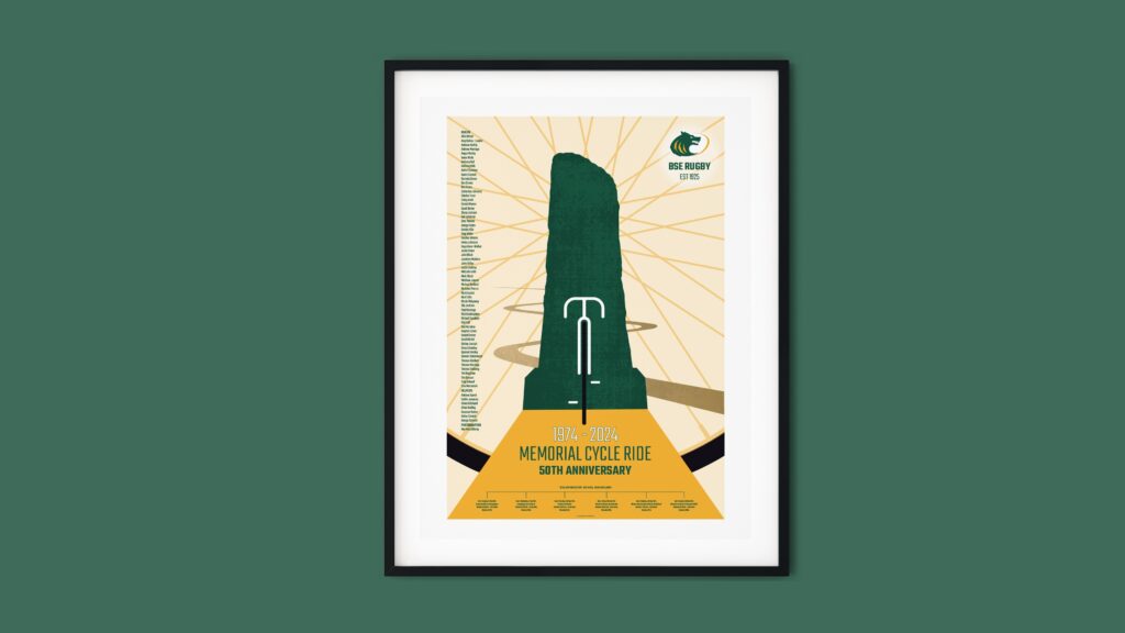
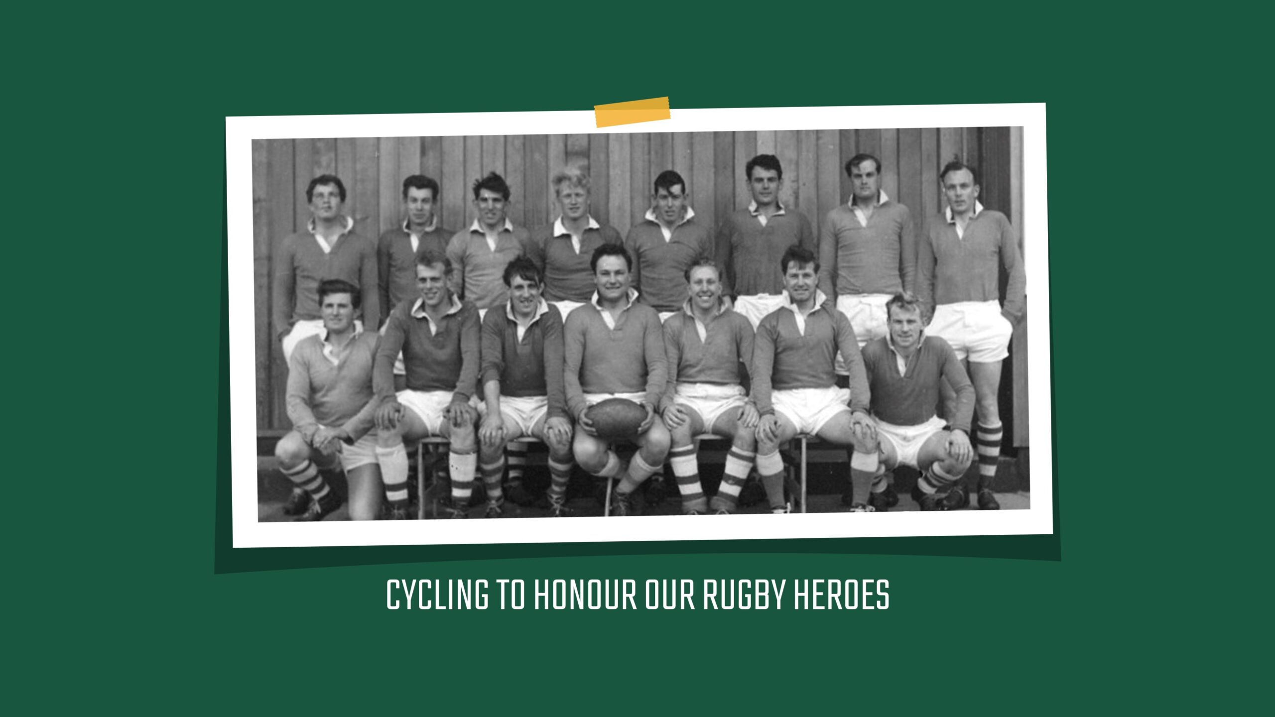
CAUSE: New branding for Bury St Edmunds Rugby Football

Redesigning the Bury St Edmunds RUFC branding to establish a modern, clear, and unified image of the club in anticipation of upcoming memorial events, including a special 50th-anniversary match and the ‘Memorial Cycle Ride.’ This new branding will also be launched in time for the club’s centenary in 2025.
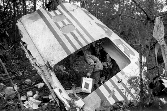
On 3 March 1974, 18 members of Bury St Edmunds Rugby Football Club tragically died when Turkish Airlines Flight 981 crashed near Paris. The players were returning to the UK after attending a France vs. England rugby match in Paris. The crash, caused by a rear cargo door failure, resulted in catastrophic decompression and the loss of control of the aircraft. At the time, it was the deadliest aviation disaster, claiming the lives of all 346 passengers and crew.
The rugby players had planned to play a friendly match in France, but when the game was cancelled, 18 members of the 21-strong touring party boarded the ill-fated flight. The loss devastated the local community, leaving families in mourning. However, the town of Bury St Edmunds and the rugby community rallied together, rebuilding and continuing the legacy of the club.
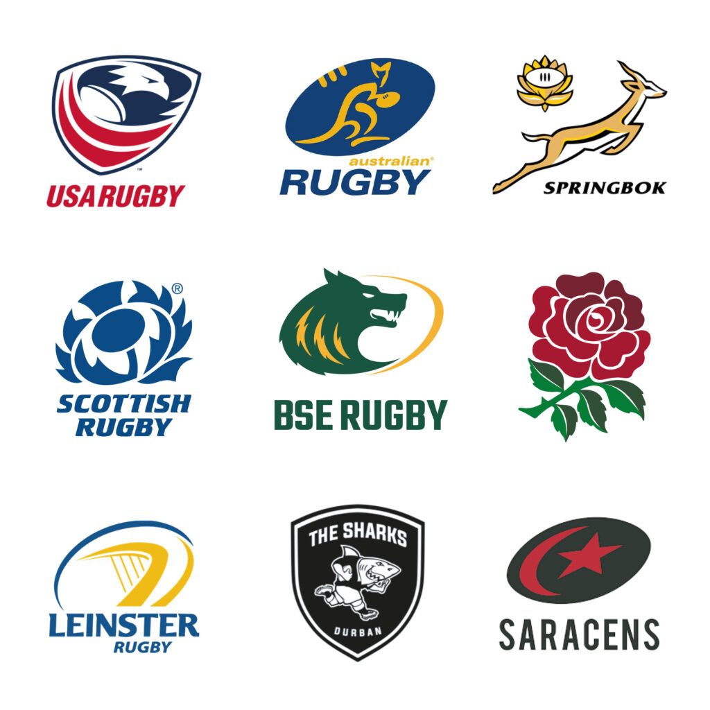
The project aimed to create a visually cohesive and recognisable identity for Bury St Edmunds RUFC, one that honours the club’s legacy while looking forward to its future. The new logo marks, typography, and existing colour scheme reflect the club’s strength, resilience, and rich history. The introduction of a ‘forward-looking’ wolf symbolises not only the spirit of the club but also protection and loyalty within the local community.
This updated visual identity preserves a strong connection to the club’s past while positioning it for the future, paying tribute to both current and former players, and embracing the club’s ongoing role within the community.


The redesign of the Bury St Edmunds RUFC brand has been met with widespread support from the club, local community and rugby fans alike. The new visual identity—centred around the club’s heritage and community spirit—provides a strong, modern presence that reflects the club’s core values while clearly distinguishing it from other rugby clubs, National League 2, East.
The branding helped define to the Memorial Cycle Ride, which drew large crowds and media attention. Furthermore, the new identity will be central to the club’s centenary celebrations in 2025, ensuring that the legacy of those lost in 1974 is never forgotten.
These efforts have ensured that the memory of the 18 players and the spirit of the club continue to live on through its supporters, with the new branding solidifying Bury St Edmunds RUFC’s place at the heart of the community.
Redesigning the Bury St Edmunds RUFC branding to establish a modern, clear, and unified image of the club in anticipation of upcoming memorial events, including a special 50th-anniversary match and the ‘Memorial Cycle Ride.’ This new branding will also be launched in time for the club’s centenary in 2025.

The project aimed to create a visually cohesive and recognisable identity for Bury St Edmunds RUFC, one that honours the club’s legacy while looking forward to its future. The new logo marks, typography, and existing colour scheme reflect the club’s strength, resilience, and rich history. The introduction of a ‘forward-looking’ wolf symbolises not only the spirit of the club but also protection and loyalty within the local community.
This updated visual identity preserves a strong connection to the club’s past while positioning it for the future, paying tribute to both current and former players, and embracing the club’s ongoing role within the community.
The redesign of the Bury St Edmunds RUFC brand has been met with widespread support from the club, local community and rugby fans alike. The new visual identity—centred around the club’s heritage and community spirit—provides a strong, modern presence that reflects the club’s core values while clearly distinguishing it from other rugby clubs, National League 2, East.
The branding helped define to the Memorial Cycle Ride, which drew large crowds and media attention. Furthermore, the new identity will be central to the club’s centenary celebrations in 2025, ensuring that the legacy of those lost in 1974 is never forgotten.
These efforts have ensured that the memory of the 18 players and the spirit of the club continue to live on through its supporters, with the new branding solidifying Bury St Edmunds RUFC’s place at the heart of the community.
